Colour is far more than a decorative choice in the workplace; it can actively influence mood, behaviour, and productivity. For specifiers, interior designers, and architects, understanding how colour shapes experiences is essential when designing offices that support both wellbeing and performance.
Research in colour psychology shows that different hues can evoke specific emotional and cognitive responses:
- Blues and greens: Promote calm, focus, and concentration, making them ideal for quiet work zones and meeting rooms.
- Yellows and oranges: Stimulate energy, creativity, and collaboration, often suited to breakout areas and innovation hubs.
- Neutrals: Provide balance and act as a backdrop for dynamic features, helping prevent overstimulation in open-plan offices.
Strategically applying these principles ensures that each space within the office aligns with its intended function.

An agile office often requires multiple activity zones, each with its own colour strategy:
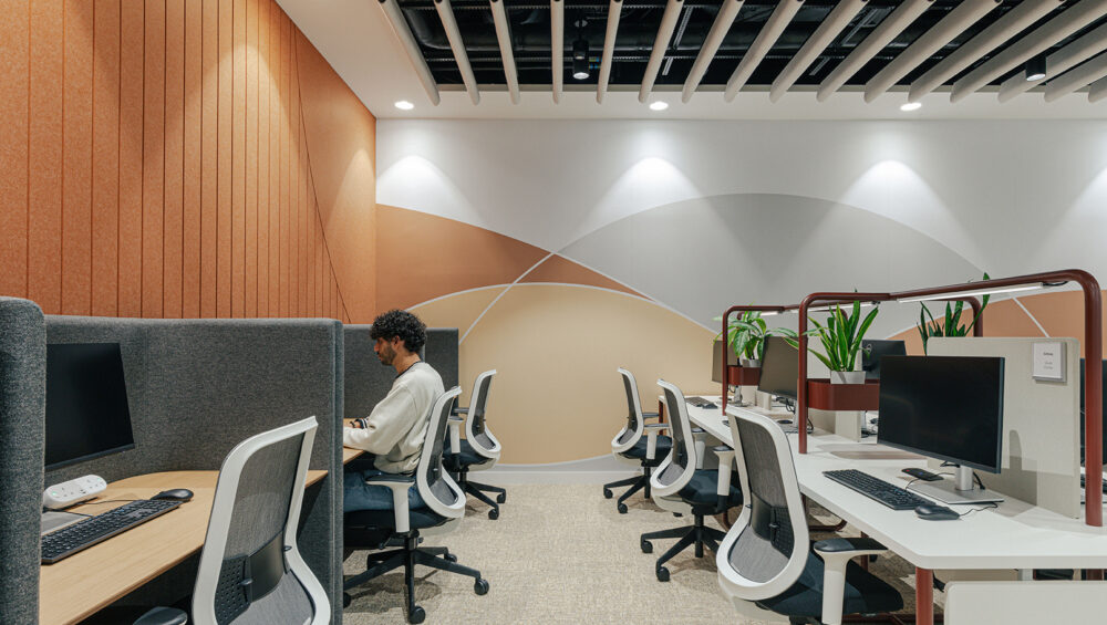
- Focus areas: Cooler, muted tones reduce stress and visual distraction.
- Collaboration spaces: Warm, vibrant colours can boost engagement and creative thinking.
- Circulation and social areas: A thoughtful mix of colours can guide movement, subtly signalling where informal interaction is encouraged.
By integrating colour psychology into zoning, designers can enhance the functionality of each area while supporting employees’ emotional and cognitive needs.
Colour also reinforces corporate identity. Offices are more than workspaces; they are brand experiences. Using company colours strategically in wall panels, acoustic elements, or furniture helps create a cohesive environment that reflects the organisation’s values.
At ekko Acoustics, we often work with designers to customise acoustic panels in brand colours, combining performance with visual impact. This approach ensures that acoustic solutions contribute to the overall design narrative rather than being purely functional.
- Start with purpose: Consider the function of each space before choosing a palette.
- Balance vibrancy and neutrality: Too much intensity can overwhelm; neutral tones provide rest points.
- Layer textures and finishes: Acoustic panels, textiles, and furniture can add subtle variation while supporting the chosen colours.
- Test under real lighting: Colours shift under different light sources, so mock-ups or samples are essential.
- Consider longevity: Choose palettes that can adapt as the business evolves, avoiding frequent redecoration.
“Leveraging colour psychology in office design is more than aesthetics it’s about creating environments that enhance mood, focus, and collaboration.”
Colour strategy is most effective when coordinated with lighting, acoustics, and materials. Early collaboration between interior designers, architects, and specialists ensures that colour choices support comfort, usability, and wellbeing across the workplace.
Leveraging colour psychology in office design is more than aesthetics — it’s about creating environments that enhance mood, focus, and collaboration. Thoughtful, evidence-based use of colour can transform an office into a high-performing, engaging space that reflects both brand and culture.